Gallery Pal Design Sprint
This 5 day Google Venture Design Sprint was centered on the client Gallery Pal. Gallery Pal is a fictional company looking to give art enthusiasts the best museum experience possible. The goal for the 5 day Sprint was to deliver a working prototype of a mobile app or mobile web app that addressed the problem they identified.
Problem
Gallery Pal conducted expert interviews with museum guides and user interviews with museum enthusiasts that uncovered a problem: those going to museums did not have the best experience because information was limited. Gallery Pal wants to solve this problem by creating a mobile app or mobile web app to help users get a better understanding of the art they are looking at while in a museum or gallery. On this project, I acted as the sole UX designer.
Day 1: Map
The biggest problem seems to be that museum goers want to learn more background information about a piece of art to fully appreciate what they are looking at. Gallery Pal conducted some user interviews and I noticed three themes from their interviews and main persona:
Interviewees said they would have a better experience if they just knew some more information about what they are looking at. Even if a gallery attendee researches ahead of time, they still find something new they don’t know anything about.
While at the museum or gallery, people often look up information about an artist or piece of art. However, the major pain point is that they find too much information and get bored of it. It’s too hard to sort through and they want succinct information from an expert.
Many interviewees wanted to know more about the artist - their techniques, their background, direct from the artist if possible.
In one of the expert interviews, a museum guide gave insights into her experience with museum and gallery goers. Her goal as a guide seems to be quite similar toGallery Pal’s: she wants people on her tour to leave the museum knowing more about the art on display than when they entered so they can have a deeper appreciation of and understanding of what they have just seen. She said most people join her tours because they know nothing about the art on show, with a smaller fraction coming in having done some level of research. She said that in order to keep their attention, she conducts her tours through storytelling - giving information about the artist, their background or why they became an artist, and then goes into the specifics of the piece of art, its composition, etc. The best way, according to her, for a museum goer to appreciate art is to take the tour then go back and look at the art again - look at it a little differently, take note of colors, or techniques that they may not have noticed before - so they can leave the museum having a great experience and grow their appreciation for art.
Based on this information, I believe that creating an app that is simple and quick to use will solve the problem at hand. An encyclopedia for art that does not have pages and pages of information will likely be the key to solving this problem.
Day 2: Sketching
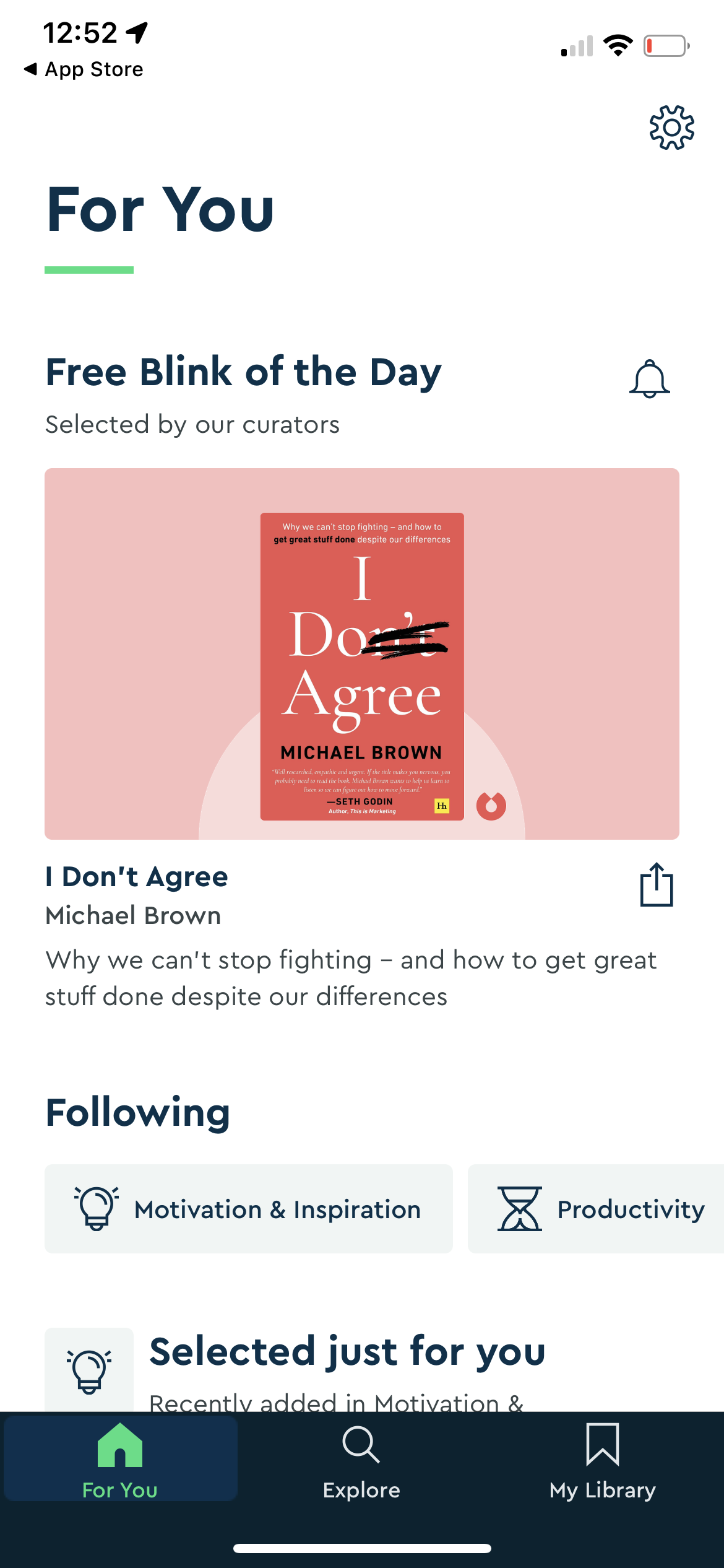
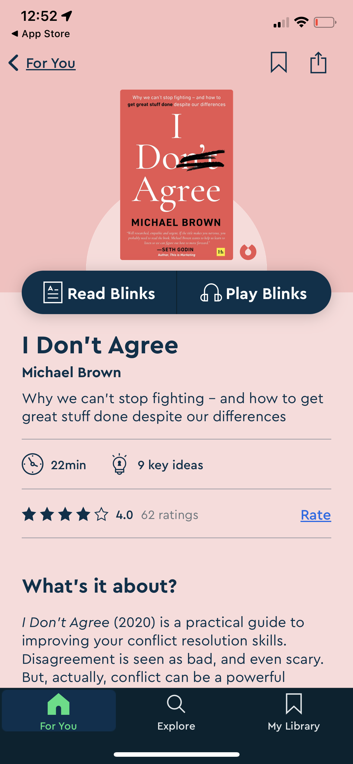
The second day is designed for sketching, but in order to get some inspiration, I conducted a mini-competitive analysis and looked for apps that had scannable, bite sized information. I thought about language learning apps, and apps that give summaries of complex topics. One app that does a great job of this is called Blinkist. It gives short summaries and highlights of different books. It also has a great audio feature. I really like how they lay out the “Key Ideas” and give time estimates for all the information. For Gallery Pal, one pain point is accessing succinct information and this does a great job at summarizing information.
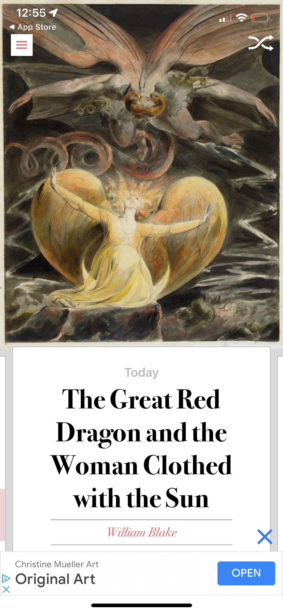
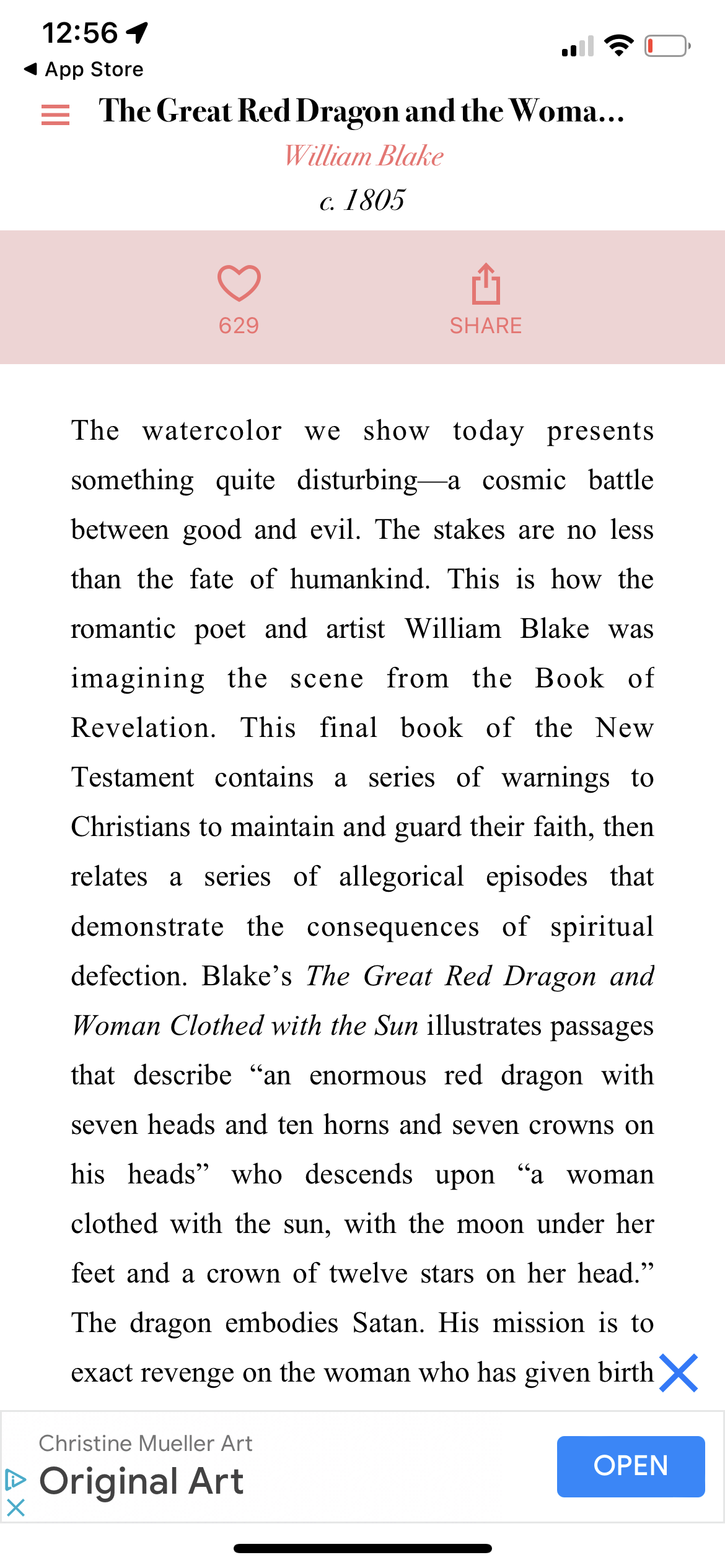
I also looked into Art apps and found DailyArt. It has a ton of languages and is very simple to use and minimal in UI style. The home screen is the days’ artwork that you can scroll to learn a little more about. The artist bio is kept separate which I’m not sure I like, but the information about the days’ selected artwork is brief and to the point which would fit well with Gallery Pal’s need for short information, but not as well with the request for more context on the artist. The context of the art gives exactly what Gallery Pal’s target audience is looking for: context on the art, artist, techniques, and other significant information all in a few short paragraphs. It does also give links to additional information which is a nice touch for those who may want to learn more.
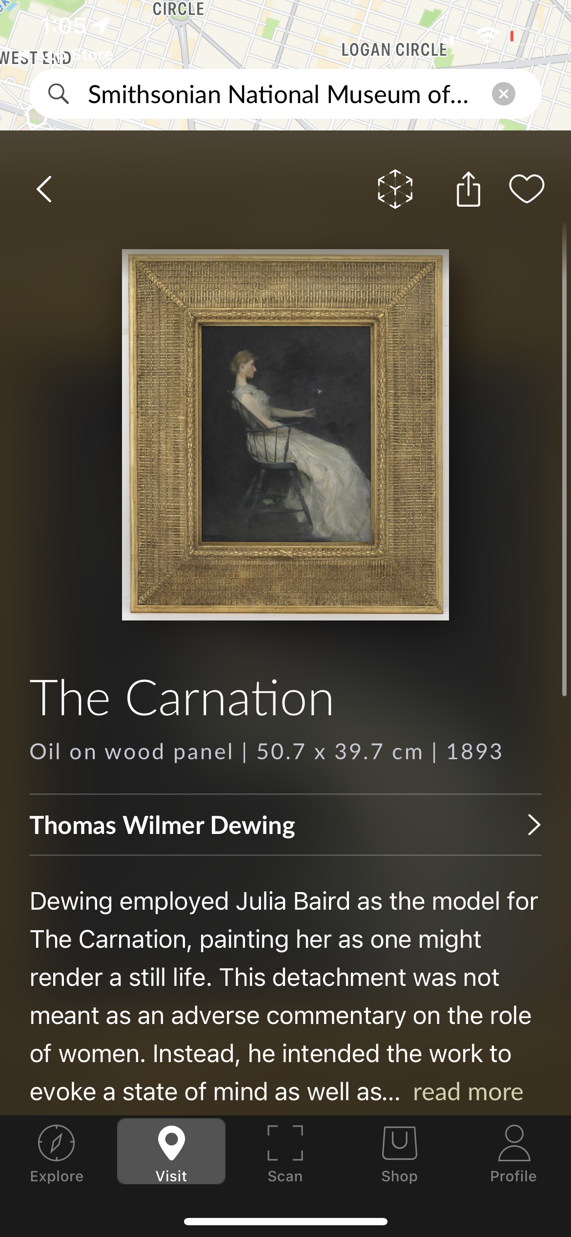
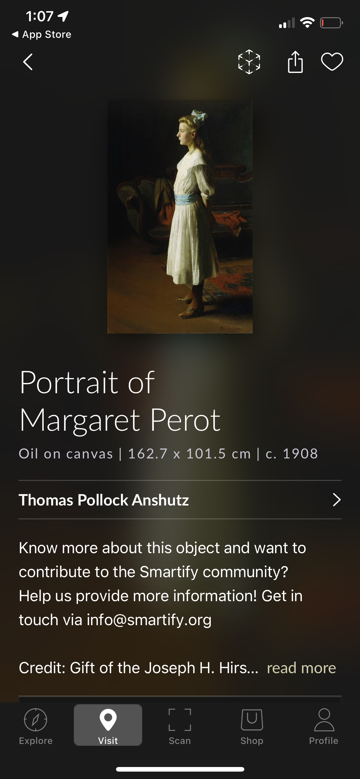
I also looked for different museum apps, and found Smartify, an app that you can use to search for thousands of pieces of art and museums. It has a great map feature and you can easily browse the collections online. What I like is the easy browsing feature and layout of the screen with the artwork. However, some artworks link to external websites which isn’t so great because the websites are hit or miss as to if they give any information about the painting other than the size, medium, year painted, location, etc.
Solution Sketch
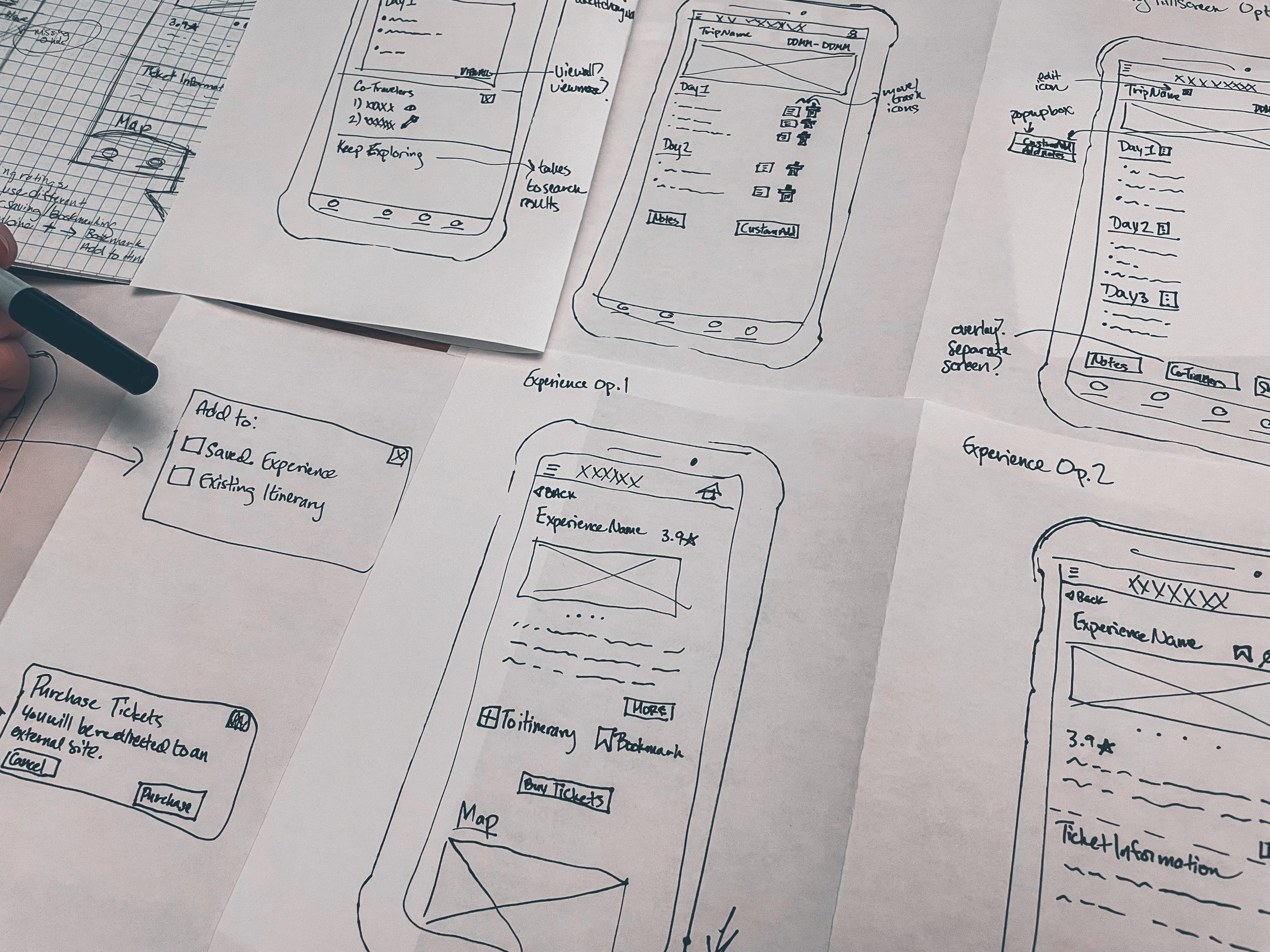
In order to brainstorm some quick potential solutions, I divided a piece of paper into four quarters and set a timer to come up with a as many different solution sketches as possible. Of the 8 options I came up with, I chose to go with my final option which showed the artwork front and center with the artist name, art name and year at the top. I wanted to make sure that each article of information would be able to be used for both reading and listening if the user wants to feel like they’re on a guided tour. I imagine a short bio of the artist, with links to more information, and a longer section on the art with information from a curator or docent explaining the key features of the art, with highlights of what to look for or even key style features that you can see across the artists’ collections, and maybe even some links to other pieces of art if it is one painting in a series for example.
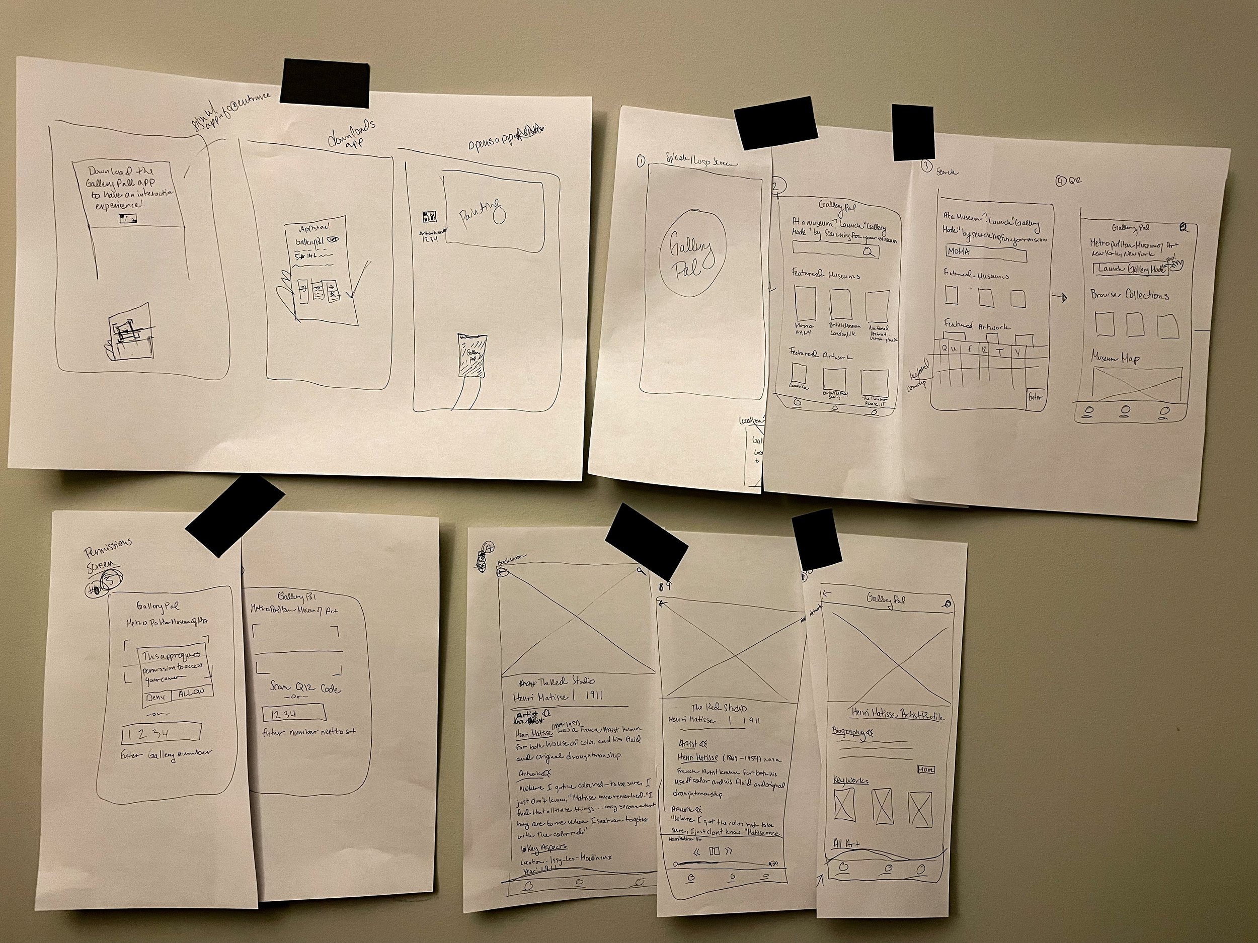
Based on the solution from the Crazy 8’s exercise, I decided that the best approach would be to give users the ability to scan a QR code or enter a number next to the piece of art so they can get more information. I think I will also add a regular search feature for this. They scan the QR code or enter the information and a screen comes up with a picture of the artwork with the artist name, artwork title and year directly underneath it.
There will be a very short bio that gives a small piece of information about the artist, and the user can tap on the artist name for their full bio. The main part of the artwork is explained below with the key features of the art. I will reverse the key features and the full summary. Gallery Pal’s users want quick information while looking at the art, so by organizing it into bite sized information, they can get the highlights about the work of art while being able to appreciate it in person.
Day 3: Storyboarding
I decided to think like Gallery Pal’s primary persona Angela. Keeping in mind her needs, I thought about her walking into the museum, maybe walking around and seeing a piece of art she liked and wanted to know more about it. I kept that in mind as I thought about what screens she would want to look at while looking at the artwork, and how the information should be presented. This helped me to envision sketches for the prototype.
Day 4: Prototyping
My goal for the prototype was to check the flow of the solution. A user opens the app, enters “Gallery Mode” by searching for their museum, scans a QR code, and can then access the information. I initially thought about making a chat bot, or using image scanning, however QR codes can be scanned from further away and would present a more accurate result to image scanning, and relying on a chat bot would mean the museum goer would have to know the name of the artwork with the correct spelling, so I settled on QR codes. I also left the option open for users to enter an artwork number next to the artwork in place of a QR code if they are unable, or do not want to, use their camera.
I hope to check this flow and get general feedback on the information page by museum enthusiasts. All of the participants I have recruited for the usability test enjoy going to museums, so I am curious to know if this would give them enough information, or if they would like more information, different information, etc.
The prototype in XD can be found here.
Day 5: Validate
The goal for day 5 was to check the solution with users. I recruited 5 museum participants who regularly visit museums and galleries. These ranged from a Sales and Marketing Manager in Korea to a nurse close to retirement in her 60s. The interviews were conducted over zoom, and additional notes can be found here.
The general feedback was that it was easy to use. None of the participants really struggled with the task at hand but were curious about other features. Only one person got confused on the QR page. One user took out her phone and thought she had to scan the QR code before remembering that she was supposed to be in a museum already and using the app.
One participant remarked that it was good that there was a gallery number option since she’s seen older people struggle with using QR codes and recounted a time when she recently helped an elderly woman at the symphony use her phone to scan a QR code to access the program. And another participant said he just really didn’t like QR codes but did not struggle with the process. I wanted to include both a QR code and a number option for these reasons.
The information level seemed to be just right for everyone. Only one user remarked that she may look for more information since she loves art, but it was easy to scan and gave just enough. The participants also liked that there was information on the artist. One participant said she enjoys reading about art from the artist themself over a critic when available because she likes to form her own opinions, so she liked that it was neutral information and was not presented in a way that gives an opinion. However, another participant said that critiques could be interesting to include if available.
Conclusion
Gallery Pal presented evidence to suggest that museum goers may not be having the best experience. For all, they wanted a way to find out more information about an artwork while they’re looking at it including information about the artist. A few of the art enthusiasts they interviewed said that there was too much information to sort through if they just Googled information about an artwork.
I decided to create an app that was easy to use to quickly get them to the information they were looking for. I initially thought about having a chat bot, or photo-scanning app, but ultimately decided on QR codes and artwork numbers for users to access the information which was a successful option validated by the participants in the usability test.
In the usability tests, I checked for ease of use and what participants thought about the information given and its presentation. I wanted to avoid information overload. Based on the usability tests, this was successfully validated with only one participant citing she may want more information but that’s because she loves having all the information she can find. Participants also noted that the app was easy to use and did not distract away from the artwork they would be trying to enjoy. Overall, the Gallery Pal app I designed during the 5 day Design Sprint seems to have fully addressed the client’s, and user’s, needs.

