Kanban Zone Pricing Page Re-Design
The Industry Design Project from Springboard Learning matches UX Design students with companies in need of UX Design expertise. The client, the CEO of Kanban Zone, wanted to re-design the pricing page on his website in order to convert visitors to customers.
Project Overview
Kanban Zone is a SaaS company providing a Kanban software aiming to help their customers, from individuals to enterprises, efficiently streamline their work processes. Kanban Zone was in the process of overhauling their website and one of the last pages they needed to update was their pricing page. The task was to re-design the pricing page based on UX principles to make it the best possible page for both desktop and mobile browsing. We conducted a competitive analysis, user interviews, and delivered a final hi-fidelity prototype of the website page and mobile web page. The official page will be launched soon, and the results of our efforts will be updated accordingly.
On this project, I served as a UX Designer in a group of four people. My primary focus was on writing the script and conducting User Interviews, conducting Secondary Research, and managing UX Copywriting. This project was completed over the course of 5 weeks, with the client giving specific instructions for deliverables for each week. Week 1 was the introduction, Week 2 we had to present research findings, Week 3 we had to present wireframes, Week 4 we had to present the hi-fidelity prototypes, and Week 5 we had to deliver the final designs for handoff through Figma.
Problem Statement
Any business owner with a website knows that the most important page on their website is the pricing page where potential customers can find out about the product and how much it costs. The CEO of Kanban Zone recruited us to help fix the pricing page on his website because it was not converting users.
Hypothesis
According to Google Analytics, 99% of the users were coming onto the website via their blog page, with less than 1% continuing on to visit the pricing page before dropping off the website entirely. The pricing page was visually inadequate, too difficult to navigate and did not explain what their product was which resulted in low conversion rates.
Research
During the initial client interview, he did not give a specific goal to us in terms of the number of new users he would like to see the pricing page convert. He simply asked for the best pricing page possible based on UX design principles. I knew that the first thing I needed to do was to research Kanban board competitors and look into the psychology behind what makes a successful pricing page convert visitors to customers in order to understand the problem space better. There was some competitive research that we had access to from a previous design group and we were also given a primary persona by the client.
A few key insights included:
The pricing page that was in use by the client lacked visual cues. We pitched the Anchoring effect as a solution to this problem. Notion does a good job of highlighting their preferred plan by giving visual cues and utilizing color to highlight the Team plan.
Their direct competitors used cards to separate the different plans, which makes sense given Kanban uses this type of organization naturally. The competitors ranged from more minimal colors and style, such as Notion, to bright colors and styles such as ClickUp.
Of the 7 different competitors studied, I noticed that they used accordions to expand and show all features available for their product. However, some competitors, including Notion, did not include the top features of each plan making the user dig for information.
Wireframing
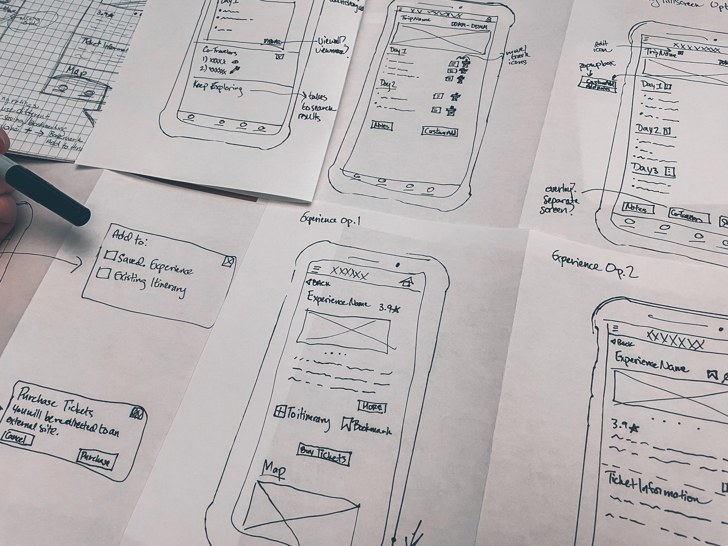
After our client meeting where we presented the research, we had the greenlight to begin wireframing potential solutions. The client wanted 2-3 options each of the pricing page for both desktop and mobile web with a clean, minimal style to match the Kanban Zone philosophy. The client also requested that we highlight the “Add-ons” section separately to try and get users to add those to their account. We brainstormed some potential solutions as a group, and decided to use cards to easily organize the information, with different cards for the different membership tiers. This helped break out the information on mobile to make it more readable.
We brainstormed as a group, and decided to use cards to easily organize the information and help break out the different tiers on mobile more easily. One piece of information I pushed the client for was to give us the top 5 features for each plan to highlight on the respective cards. The old version of the website did not highlight any specific features that would differentiate Kanban Zone from other kanban products, so this became an important part of the design I continued to advocate for throughout the project. By putting the top features at the top, a user could easily get a snapshot of the different features of the product to motivate them to learn more about the product and sign-up for the free trial.
While the rest of my team worked on the wireframes, I wrote the script for the first round of user interviews. The lo-fidelity wireframes for both desktop and mobile were then presented to a group of test users for interviews.
User Interviews 1
My role was to write the interview script and help conduct the actual user interviews. I asked questions based on how the users felt about the wireframes to dig into if the design was fulfilling the purpose of creating a better pricing page and converting users. The results showed that users were able to easily complete almost all of the tasks asked of them. The biggest issue was the location of the full features section. The client was adamant that the “Add-ons” should be directly below the pricing cards.
“Add-ons” on Kanban Zone enhance the experience of the product, and are a way to get more money per subscriber per month. The interviews validated my initial analysis that the add-ons should come later in order to streamline how the user was presented with the information – users wanted to know what the product was before they were interested in learning about additional costs.
Some key findings:
Users were confused on where to find the full feature list because it was at the bottom of the screen (circled in red below). Users also did not like the checked boxes for the add-ons section and found it a little bit awkward (circled in blue below).
All 5 users had difficulty finding the features list on mobile, and 4 out of 5 users had difficulty with finding the full feature list on desktop as well because it was at the bottom of the page.
Hi-Fidelity Prototype
After presenting the wireframes and first user interview results to the client, he gave us their branding guidelines to make the first hi-fidelity frames. The rest of the team worked on the prototype while I compiled the text for the pricing page, from headings to the exact order that the features would need to go in. Because the client had not given me his top features, I created a sample of what I thought would be the top features and presented that to him for approval. After that, I adjusted the copy so the prototype would be consistent with all of the approved language from the client.
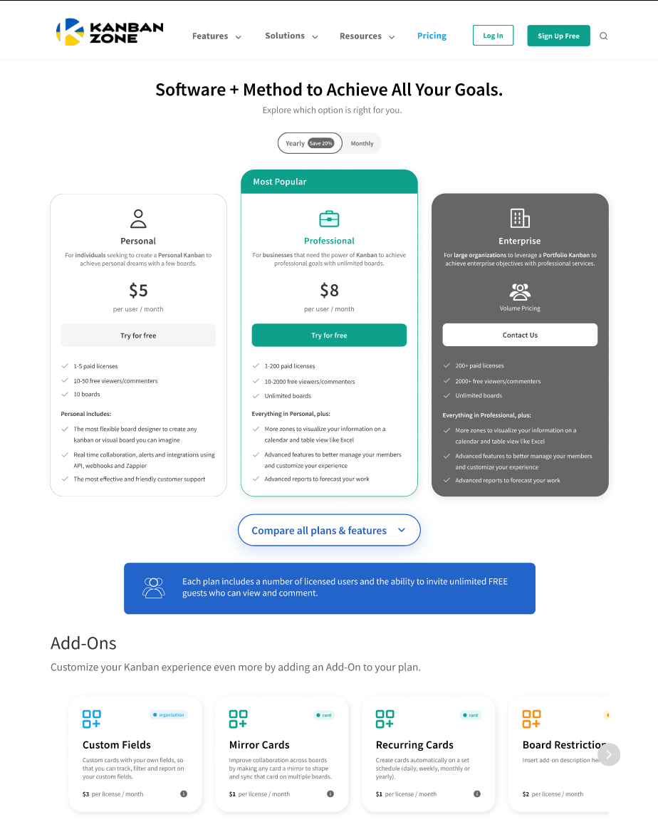
We opted to go for two versions of the plan features button to present to the client, and to test in the second round of user interviews, which is circled in red below. The button on mobile more closely represents the buttons on the original pricing page, while the button on the desktop offers a more modern design. The feedback from the interviews regarding the checked boxes in the Add-ons section led to changes. The checked boxes were replaced by separate cards, with horizontal scrolling available on mobile.
However, one thing that did not change even though it is what the user interviews suggested, was the placement of the all plan details button, the same button circled below. This was a decision by the team to appease the client’s request to keep it below the Add-ons section.
User Interviews 2 and Final Designs
The second round of user interviews was then conducted with 5 new individuals to check the improvements made from the initial wireframes to the hi-fidelity frames. The following changes were made to the final design based on the feedback:
Before turning over the final prototype to the client, the “compare all plans & features” button (circled in red below) was moved up because users in the second round of testing still had trouble finding this button.
The users tested responded better to the rounded shape for the same button so this was implemented for both mobile and web.
In order to highlight the Professional plan and draw users towards that plan, so we removed color from the Personal card and made the Enterprise card dark grey. In doing so, the user is drawn first towards the Professional plan.
Results
The final contribution I made to the project was conducting a final check on the prototype for copy errors, and we presented it to the CEO of Kanban Zone. Because we had built trust with him over the previous weeks, and because there were two rounds of usability tests to back the change up, he supported the move of the add-ons section in the end. Although he was initially hesitant to do user testing, the client understood its’ importance after we shared the feedback. It is not easy to get a client to always listen to your ideas, especially when they have their own beliefs about what is best for their product. However, the important part of UX Design is building the best experience possible for the user, and because of the research, the client was able to be convinced this small move would be what is best for his potential new clients.
The new web page created will be updated soon on the Kanban Zone website and mobile website. The client gave us permission to re-visit Google Analytics after the page is live to further collect data and see how the page is doing. I will look again at the data for how many people are going from the pricing page to the payment page to see if visitors are converting. The pricing page before was bulky and hard to navigate, especially on mobile. By reorganizing the page based on UX principles, I believe we created a page that can convert users looking for a kanban solution for their personal or professional life.
Lessons Learned
The client was very passionate about his product which showed during our meetings. It took a little extra effort to build trust with him, but he was amenable to suggestions because he wants to continue growing his product. Even though he was skeptical of user testing, it was the user testing that helped us guide the client towards a great pricing page based on the UX design process and thorough research. It is important to find ways to navigate different opinions with a client, but using research from users was the key to success with this client.
I would have liked to have done a little more research into the Kanban Zone users. Had there been more time, I would have liked to have taken this task on, but we had to use the research that had already been done. The client had previously worked with other UX designers on other areas of the website, including target users, but I found the information to be a little incomplete. Based on the timeframe, it was difficult to recruit users for testing that we felt were truly reflective of the target audience, but we did the best we could.


